
Name tattoo designs: four lettering styles compared
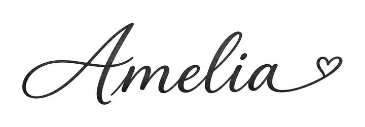
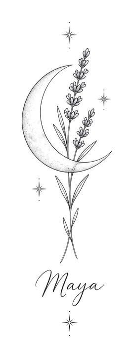
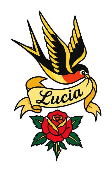
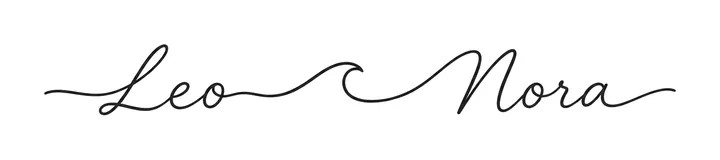
The same name can be a whole tattoo or a small detail in a bigger one. These four name designs were made by InkFit's free preview for fictional orders. Here is what each style looks like and how big the lettering comes out at the width that was ordered.
The four designs
How big the name comes out
The width you order is the width of the whole design, measured the way the stencil PDF measures it: from the leftmost to the rightmost inked point. How much of that is the name depends on the style.
| Style | Ordered width | Whole design at that width | The name |
|---|---|---|---|
| Script (Amelia) | 3 in | 3 × 0.77 in | The name is the design: 3 in across, heart included |
| Fine line (Maya) | 3 in | 3 × 10.4 in | About 2.3 in across, under a tall moon |
| Traditional (Lucia) | 4 in | 4 × 6.7 in | About 2 in across, on the banner |
| Minimalist (Leo and Nora) | 3 in | 3 × 0.34 in | Both names and the wave in one thin 3 in line |
Two things stand out. A name on its own (Amelia, Leo and Nora) uses the full width, so a small width still gives readable letters. A name inside a bigger design (Maya, Lucia) gets only part of it, and a narrow vertical design like the moon becomes much taller than its width suggests: the Maya design at 3 in wide is over 10 inches tall, so its stencil prints in two overlapping parts.
Picking a style for a name
| Style | What the lettering looks like | Good for |
|---|---|---|
| Script | Connected, hand-lettered strokes with thick and thin parts, room for a small ornament | A name as the whole tattoo |
| Fine line | Thin, even single-needle script, usually small next to the main image | A name added to a delicate design |
| Traditional | Bold black letters on a banner, with solid color around them | A name inside classic flash: banners, hearts, swallows |
| Minimalist | Very thin script and plain lines, no shading | Two names or a short word on a small spot |
Very thin lettering can soften as a tattoo ages. If your name will be small, ask your tattoo artist how small they would go on your skin and placement before you choose a width.
Spelling
InkFit asks the image model to letter your words exactly as typed, with the same capitals. All four names here came back spelled correctly on the first try, but a model can still swap or drop a letter. Check the spelling on your free preview before you pay; if a paid design gets the lettering wrong, you get one free redo.
Design your name tattoo, with a stencil to print
Questions
What is the best style for a name tattoo?
It depends on whether the name is the whole tattoo or part of one. Script suits a name on its own; fine line suits a small name next to a delicate image; a traditional banner suits a name inside bold flash; minimalist suits two names or a short word on a small spot.
How wide should a name tattoo be?
Width is measured across the whole design. In the examples, a script name at 3 in wide is 0.77 in tall, while a name inside a 3 in fine-line moon is about 2.3 in across. Ask your artist how small they would go for your placement.
Can I add two names?
Yes. List up to 3 names or words, one per line, spelled exactly as you want them inked. The Leo and Nora example has two names joined by one line.
Will the name be spelled correctly?
We ask the model to letter the words exactly as typed. Check the free preview; if a paid design gets the lettering wrong, you get one free redo.
Can you use a font I like?
You can describe the lettering style in your idea, like flowing script, bold block letters or thin handwriting. The letters are drawn by the image model, not set from a font file.